:root {
--max-width: 1440px;
--column-width: calc(var(--max-width)*.9 *.33);
--heavy-type: bold;
--dark-text: #000000;
--medium-text: #767676;
--light-text: #979797;
--light-bg: #f0f0f0;
--purple: #883CAD;
--pink: #c61e9d;
--green: #32806e;
--green: #32806e;
--blue: #4077c9;
--yellow: #efbc28;
--transparent-white: rgba(255,255,255,0);
--purple-pink-gradient: linear-gradient(to bottom, var(--transparent-white) 40%, var(--purple) 60%, var(--pink));
--pink-purple-gradient: linear-gradient(to right, var(--pink), var(--purple) 70%);
--heading-multiplier: 1;
--module-padding: 4rem 6rem;
--module-padding-vertical: 4rem 0rem;
--vh: 1vh;
--font-size: 16px;
--swiper-navigation-size: 30px;
--swiper-theme-color: var(--purple);
}
main { display:none; }
@media only screen and (max-device-width: 1024px) {
:root {
--max-width: 100%;
--heading-multiplier: 0.9;
font-size: calc(var(--font-size) * 0.75); /* 12px */
}
}
* {
box-sizing: border-box;
}
body {
padding: 0px;
margin: 0px;
font-family: 'Apercu Pro Regular', Arial, Helvetica Neue, Helvetica, sans-serif;
font-style: normal;
font-weight: normal;
color: var(--dark-text);
overflow: hidden;
}
main {
max-width: var(--max-width);
margin: 0px auto;
}
.button,
h1, h2, h3, h4, h5 {
font-family: 'Apercu Pro Medium', Arial, Helvetica Neue, Helvetica, sans-serif;
font-weight: normal;
padding: 0px;
margin: 0px;
}
h1, h5 {
font-weight: normal;
}
h2, h4 {
font-family: 'Apercu Pro Bold', Arial, Helvetica Neue, Helvetica, sans-serif;
text-transform: uppercase;
font-weight: normal;
}
strong {
font-family: 'Apercu Pro Bold', Arial, Helvetica Neue, Helvetica, sans-serif;
font-weight: normal;
}
.quote p {
font-family: 'Apercu Pro Bold', Arial, Helvetica Neue, Helvetica, sans-serif;
}
hgroup {
white-space: normal;
max-width: 80%;
margin: 0px auto;
}
h1 {
font-size: calc(var(--heading-multiplier) * var(--style-font-size, 1) * 1.625rem);
line-height: calc(var(--heading-multiplier) * var(--style-line-height, 1) * 2.5rem);
margin-bottom: 1.25rem;
text-transform: none;
}
h2 {
font-size: calc(var(--heading-multiplier) * var(--style-font-size, 1) * 1.625rem);
line-height: calc(var(--heading-multiplier) * var(--style-line-height, 1) * 2.5rem);
margin-bottom: 1.25rem;
text-transform: uppercase;
}
h3 {
font-size: calc(var(--heading-multiplier) * var(--style-font-size, 1) * 2.25rem);
line-height: calc(var(--heading-multiplier) * var(--style-line-height, 1) * 2.875rem);
margin: 1rem 0 4rem 0;
color: var(--medium-text);
}
h4 {
font-size: calc(var(--heading-multiplier) * var(--style-font-size, 1) * 1.625rem);
line-height: calc(var(--heading-multiplier) * var(--style-line-height, 1) * 2.5rem);
text-transform: uppercase;
}
h5 {
font-size: calc(var(--heading-multiplier) * var(--style-font-size, 1) * 1.25rem);
line-height: calc(var(--heading-multiplier) * var(--style-line-height, 1) * 2.5rem);
text-transform: none;
color: var(--light-text);
}
p, li {
font-size: calc(var(--style-font-size, 1) * 1.25rem);
line-height: calc(var(--style-line-height, 1) * 2.5rem);
}
a, a:visited, a:active {
color: var(--purple);
text-decoration: none;
}
a:hover {
text-decoration: underline;
}
address {
font-size: calc(var(--style-font-size, 1) * 1.25rem);
line-height: calc(var(--style-line-height, 1) * 2.5rem);
font-style: normal;
display: block;
}
.module {
display: flex;
flex-direction: column;
padding: var(--module-padding);
position: relative;
overflow:hidden;
}
.module.grey {
background-image: linear-gradient(#F2F3F7, #ECEDF3);
}
.module hgroup {
text-align: center;
}
.header-nav {
font-family: 'Apercu Pro Light', Arial, Helvetica Neue, Helvetica, sans-serif;
position: fixed;
top: 0px;
width: 100%;
z-index: 1000;
}
.footer-nav ul, .header-nav ul, .module ul {
margin: 0px;
padding: 0px;
}
.footer-nav ul li, .header-nav ul li, .module ul li {
display: inline-block;
list-style: none;
font-size:1.1rem;
}
.copyright {
color:white;
}
.header-nav .logo,
.header-nav .alt-logo {
height: 2.5rem;
margin: 0.5rem 2rem 0.5rem 2rem;
}
.header-nav .logo {
display:inline-block;
}
.header-nav .alt-logo {
display: none;
}
.header-nav.solid .logo {
display: none;
}
.header-nav.solid .alt-logo {
display: inline-block;
}
.header-nav section {
display: flex;
position: relative;
justify-content: space-between;
height: 5rem;
width: 100%;
max-width: var(--max-width);
padding-top: 0.5rem;
margin:0 auto;
}
@media only screen and (max-width: 768px) {
.header-nav section {
background-color: #fff;
}
}
.header-nav.solid {
background: var(--pink-purple-gradient);
}
.header-nav ul {
display: flex;
flex-direction: row;
align-content: flex-end;
max-width: var(--max-width);
margin: 0px;
transition: background 0.3s ease-in-out;
transition: opacity 0.1s ease-in-out;
}
.header-nav ul.unpositioned {
opacity: 0;
}
.header-nav li {
padding: 1rem;
border-radius: 5px;
}
#mobile-menu li {
border-radius: 0;
}
.header-nav li,
.header-nav a {
text-decoration: none;
font-size: 1.25rem;
line-height: 2rem;
color: var(--dark-text);
cursor: pointer;
}
.header-nav.solid li,
.header-nav.solid a {
color: #fff;
}
.header-nav li:hover,
.header-nav a:hover {
color: var(--pink);
background-color: transparent;
}
.header-nav.solid li:hover,
.header-nav.solid a:hover {
color: var(--yellow);
background-color: transparent;
}
.header-nav .button {
line-height: inherit;
padding: 0px;
margin-top: -1rem;
}
.header-nav li.hasmegamenu:hover
{
background-color: #fff !important;
}
.header-nav.solid li:hover {
color: var(--pink);
background-color: transparent;
}
.header-nav.solid .megamenu li {
color: var(--dark-text);
}
.header-nav.solid .megamenu a {
color: var(--purple);
line-height: 1.5rem;
}
.header-nav.solid .megamenu a:hover {
color: var(--pink);
}
.megamenu ul {
margin-right: 0;
}
.megamenu li {
color: var(--dark-text);
display: flex !important;
list-style: none;
flex-direction: column;
justify-content: space-between;
padding: 0 0 3rem 0.5rem
}
.megamenu {
flex-direction: row;
padding-left: 6rem;
max-height:0px;
display:none;
height:auto;
overflow:hidden;
margin-top: 4rem;
transition: all 0.3s ease-out;
}
li:hover .megamenu {
display: flex;
position: absolute;
top: 0.5rem;
left: 0px;
padding: 2rem 3rem 2rem 6rem;
max-height: 1000px;
}
.megamenu p {
color: var(--dark-text);
line-height: 1.625rem;
}
.megamenu-intro {
max-width:30%;
padding-right:5%;
}
.megamenu-intro h4 {
color: var(--purple);
}
.megamenu-links {
width: 70%;
display: inline-block;
}
.megamenu-links ul {
max-width: 100%;
flex-wrap: wrap;
flex-direction: row;
position: inherit;
top:auto;
right:auto;
margin-top:0;
}
.megamenu-links ul li {
width:33%;
font-weight: normal;
}
.megamenu-links ul ul {
flex-direction: column;
padding: 0;
margin: 0;
}
.megamenu-links ul ul li {
width: 100%;
padding: 0.25rem 0rem;
}
.sentinal {
position: absolute;
top: 5rem;
}
.parallax {
z-index: 3;
}
.parallax::after,
.parallax::before {
transform: translateZ(-4px) scale(1.25);
content: " ";
position: absolute;
left: 0;
top: 0;
background-repeat: no-repeat;
z-index: -1;
background-position: center center;
opacity: 1;
background-size: 100% 100%;
height: 100%;
width: 100%;
}
.hero-module .parallax::before {
--start: -125%;
--end: -25%;
transform: translateZ(-4px) scale(1.25);
content: " ";
position: absolute;
right: -25%;
bottom: -15%;
top: auto;
left: auto;
background-repeat: no-repeat;
z-index: -1;
background-position: bottom right;
opacity: 1;
background-size: 100% 100%;
height: 100%;
width: 100%;
min-height: 30rem;
animation: slidein 1s ease-in-out;
animation-iteration-count: 1;
animation-delay: 0s
}
.hero-hex::before {
content: '';
background-image: url("/assets/images/hexes2.svg");
}
.hero-module {
z-index: 1;
max-width: var(--max-width);
margin: 0px auto;
padding: 0px;
display: flex;
height: calc(var(--vh) * 100);
min-height: 768px;
max-height: 921px;
margin: auto;
overflow: hidden;
position: relative;
flex-direction: column;
justify-content: center;
}
.hero-module .artwork {
z-index: 2;
position: relative;
height: 100%;
position: absolute;
bottom: 0px;
right: 0px;
width: 100%;
max-height: 100%;
max-width: 50%;
}
.hero-module .hero-image {
position: absolute;
bottom: 0px;
right: 0px;
max-height: 90%;
justify-self: end;
}
.hero-module .hero__content {
display: flex;
flex-direction: column;
justify-content: center;
max-width: 50%;
min-height: calc(70% - 12rem);
z-index: 1;
border-radius: 1rem;
padding: 0.5rem 0.5rem 0.5rem 0;
margin: 0 0 0 6rem;
}
.hero-module .hero__content.less-margin {
margin-top: 8rem;
}
.hero-module h1 {
max-width: 45ch;
}
.hero-module h4 {
font-size: initial;
text-transform: none;
margin-bottom: 0.5rem;
}
.hero-module nav {
margin: 2rem 0 0 0;
}
.hero-module .regulator-block {
position: absolute;
left: 6rem;
bottom: 6rem;
z-index: 2;
height: 10%;
}
.hero-module .regulator-icon {
max-height: 3rem;
}
.hero-module .regulator-icon:first-of-type {
margin-right: 3rem;
}
.mobile-hero-background {
position: relative;
height: calc(var(--vh) * 100);
width: 100%;
background-image: var(--background);
background-position: center center;
background-size: cover;
}
.mobile-hero-overlay {
height: 100%;
width: 100%;
opacity: 0.75;
backdrop-filter: blur(2px) grayscale(1);
}
.button {
display: -webkit-inline-box;
display: inline-flex;
-webkit-box-align: center;
align-items: center;
-webkit-box-pack: center;
justify-content: center;
align-self: start;
min-width: 10ch;
min-height: 44px;
text-align: center;
line-height: 1.1;
-webkit-transition: 220ms all ease-in-out;
transition: 0.2 all ease-in-out;
background: #FFFFFF;
border-radius: 2rem;
padding: 1rem 1.5rem;
margin-right: 2rem;
min-width: 16rem;
box-shadow: 0px 6px 8px rgba(93, 101, 152, 0.3);
}
li:only-of-type .button {
margin-right: 0;
}
.button:hover, .button:active {
box-shadow: 0px 17px 48px rgba(93, 101, 152, 0.1);
}
.button:focus {
outline-style: solid;
outline-color: transparent;
box-shadow: 0 0 0 4px var(--pink);
}
.module .button {
color: var(--purple);
}
.hero-module .hero__content h1 {
font-size: 3rem;
line-height: 4rem;
letter-spacing: 1px;
color: #091133;
}
.hero-module .hero__content p {
font-size: 1.25rem;
line-height: 2.5rem;
letter-spacing: 0.6px;
color: #333333;
}
.button {
font-style: normal;
font-weight: normal;
font-size: 1.25rem;
line-height: 2rem;
letter-spacing: 0.6px;
text-decoration: none;
text-transform: uppercase;
color: #000000;
cursor: pointer;
border-radius: 5px;
}
.button:hover {
text-decoration: none;
}
.hero-module .button {
background: #ffffff;
color: #000000;
}
/*
.hero-module ul {
text-align:center;
}*/
.button.main,
.hero-module li:first-of-type .button {
color: #FFFFFF;
background-color: var(--purple);
}
.hero-module li:first-of-type .button:hover {
background-image: none;
}
.hero-module li:last-of-type .button {
margin-right: 0px;
}
.wrapper {
/* The height needs to be set to a fixed value for the effect to work.
* 100vh is the full height of the viewport. */
height: calc(var(--vh) * 100);
/* The scaling of the images would add a horizontal scrollbar, so disable x overflow. */
overflow-x: hidden;
/* Enable scrolling on the page. */
overflow-y: auto;
/* Set the perspective to 2px. This is essentailly the simulated distance from the viewport to transformed objects.*/
perspective: 20px;
}
.hero-image-mask {
background-repeat: no-repeat;
-webkit-mask-repeat: no-repeat;
mask-repeat: no-repeat;
background-position: bottom right;
-webkit-mask-position: bottom right;
mask-position: bottom right;
background-size: auto 90%;
-webkit-mask-size: auto 90%;
mask-size: auto 90%;
background-blend-mode: color;
height: 100%;
width: 100%;
animation: fadein 0.5s ease-out;
animation-delay: 0s;
animation-iteration-count: 1;
opacity: 0.3;
mix-blend-mode: overlay;
}
@media only screen and (min-width: 1024px) {
.hero-image-mask {
background: var(--purple-pink-gradient);
-webkit-mask-image: var(--big);
mask-image: var(--big);
}
}
@media only screen and (max-width: 1023px) {
.hero-image-mask {
background: var(--purple-pink-gradient);
-webkit-mask-image: var(--small);
mask-image: var(--small);
-webkit-mask-size: auto 88%;
mask-size: auto 88%;
}
.hero-module .artwork {
max-width: 60%;
}
}
@keyframes fadein {
0% {
opacity: 0;
}
100% {
opacity: 0.3;
}
}
@keyframes slidein {
0% {
right: var(--start);
opacity: 0;
}
/*75% {
bottom: calc(var(--start) + calc(var(--end) - var(--start)) * 0.3);
opacity:0;
}*/
75% {
opacity: 0;
}
100% {
right: var(--end);
opacity: 1;
}
}
.hero-image-mask {
display: none;
}
@supports((mask - position:bottom right) and(mix - blend - mode: overlay)) {
.hero-image-mask {
display: block;
}
}
@supports((-webkit - mask - position:bottom right) and(mix - blend - mode: overlay)) {
.hero-image-mask {
display: block;
}
}
.mobile-only,
#mobile-nav {
display: none;
}
.desktop-only,
#desktop-nav {
display: block;
}
.header-nav .button {
background-color: var(--purple);
color: #fff;
}
.header-nav .button:hover {
background-color: var(--yellow);
color: #fff;
}
.header-nav.solid .button {
background-color: var(--yellow);
color: #fff;
}
.header-nav.solid .button:hover {
background-color: #fff;
color: var(--pink);
}
.not-tabletp,
.also-tabletp {
display:block;
}
@media only screen and (min-width: 1024px), screen and (min-height: 400px) {
.not-tabletp,
.also-tabletp {
display: none;
}
}
@media only screen and (min-width: 768px), screen and (min-height: 400px) {
.also-tabletp {
display: block;
}
}
@media screen and (max-width: 768px), screen and (max-height: 400px) {
.also-tabletp,
.not-tabletp,
.desktop-only,
#desktop-nav {
display: none;
}
.mobile-only,
#mobile-nav {
display: block;
}
.with-image article {
max-width: 100%;
}
}
@media screen and (max-height: 400px) {
.header-nav section {
background-color: #fff;
}
.hero-module {
height: auto;
max-height: none;
padding-bottom:8rem;
}
.hero-module .hero__content {
margin:6rem 0 0 6rem;
}
.locationaddress div.cqc-widget .cqc-container {
padding: 15px 15px !important;
}
.hero-module .regulator-block{
bottom: 1rem;
}
}
@media only screen and (min-width: 768px) {
.mobile-hero-background {
display: none;
}
}
@media only screen and (max-width: 1024px) {
#mobile-menu-trigger {
display: none;
}
#menuToggle {
display: block;
position: absolute;
top: 1.75rem;
right: 2rem;
z-index: 1;
-webkit-user-select: none;
user-select: none;
}
#menuToggle a {
text-decoration: none;
color: var(--purple);
transition: color 0.3s ease;
}
#menuToggle a:hover {
color: var(--pink);
}
#menuToggle input {
display: block;
width: 40px;
height: 32px;
position: absolute;
top: -7px;
left: -5px;
cursor: pointer;
opacity: 0; /* hide this */
z-index: 2; /* and place it over the hamburger */
-webkit-touch-callout: none;
}
/*
* Just a quick hamburger
*/
#menuToggle span {
display: block;
width: 33px;
height: 4px;
margin-bottom: 5px;
position: relative;
background: #cdcdcd;
border-radius: 3px;
z-index: 1;
transform-origin: 4px 0px;
transition: transform 0.5s cubic-bezier(0.77,0.2,0.05,1.0), background 0.5s cubic-bezier(0.77,0.2,0.05,1.0), opacity 0.55s ease;
}
#menuToggle span:first-child {
transform-origin: 0% 0%;
}
#menuToggle span:nth-last-child(2) {
transform-origin: 0% 100%;
}
input:checked ~ #menuToggle span {
opacity: 1;
transform: translate(4px, -1px) rotate(45deg);
background: #232323;
}
input:checked ~ #menuToggle span:nth-last-child(2) {
opacity: 0;
transform: rotate(0deg) scale(0.2, 0.2);
}
input:checked ~ #menuToggle span:nth-last-child(1) {
transform: translate(0, 0px) rotate(-45deg);
}
/*
* Make this absolute positioned
* at the top left of the screen
*/
#mobile-menu {
flex-direction: row;
position: absolute;
display: block;
width: 100%;
height: calc(var(--vh) * 100);
padding: 4rem 2rem 2rem 2rem;
top: 0px;
background: #ededed;
list-style-type: none;
-webkit-font-smoothing: antialiased;
/* to stop flickering of text in safari */
transform-origin: 0% 0%;
transform: translate(0, -200vh);
transition: transform 0.5s cubic-bezier(0.77,0.2,0.05,1.0);
overflow: auto;
}
#mobile-menu ul {
flex-direction: column;
margin-left: 1rem;
}
#mobile-menu li,
#mobile-menu li li {
display: block;
padding: 0 0 0.5rem 0;
border-bottom: #000 1px solid;
margin-bottom: 0.5rem;
}
#mobile-menu li li:first-of-type,
#mobile-menu li li li:first-of-type {
margin-top: 0.5rem;
padding-top: 0.5rem;
border-top: #000 1px solid;
}
#mobile-menu li li:last-of-type,
#mobile-menu li li li:last-of-type {
border-bottom: none;
}
#mobile-menu ul {
margin-bottom: -1rem;
}
#mobile-menu li,
#mobile-menu .hasmegamenu,
#mobile-menu li a {
font-size: 1.5rem;
}
/*
* And let's slide it in from the left
*/
input:checked ~ #mobile-menu {
transform: none;
}
#mobile-menu input ~ ul {
display: none;
}
#mobile-menu input:checked ~ ul {
display: block;
}
#mobile-menu input {
display: none;
}
}
Derbyshire
Covering Derbyshire and The Peak District
Derbyshire
Covering Derbyshire and The Peak District
11 Market Place
Chapel en le Frith, High Peak
Derbyshire
SK23 0EN
[ MAP ]
Telephone : 0330 433 1537
The Most Rewarding First or Forever Job
Become a Professional Carer in 10 Days
Apply
We’ll guide you through our streamlined online recruitment process.
Train Online
Get comprehensive online training, helping you develop the skills you need.
Safety Checks
We carry out pre-employment checks to ensure suitability to work in care.
Start Caring
We'll support you along the way with development opportunities to build a rewarding care er.
What It's Like to Work at Cera
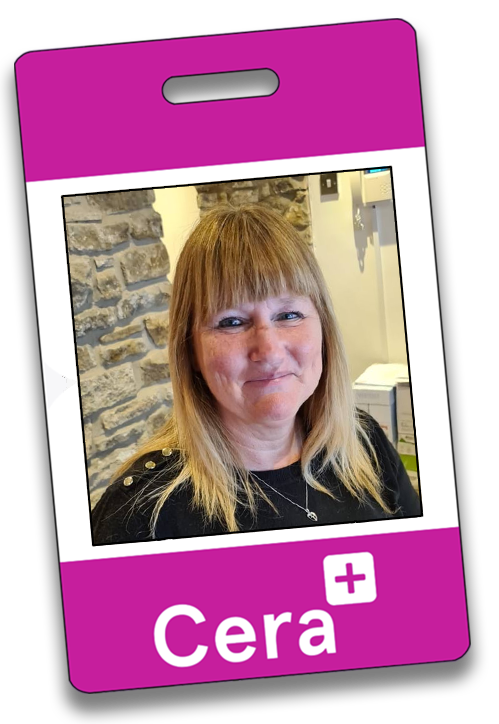
Hi my name is Jan and I have worked at Cera Derbyshire since May 2020 but I've have been in the care industry for 30 years in a number of roles. I worked at the branch quite a few years ago and have now returned as the Branch Manager.
I have some very fond memories of working here; it's so lovely to see the familiar faces of our regular service users and carers. Being a professional carer can be very rewarding and you can meet some really interesting individuals. Working with our service users gives you a sense of purpose in knowing you are making a positive difference to someone's life. You might be the only person a service user sees during the day and seeing them smile and appreciate all you do makes you feel good about yourself.
Cera Derbyshire is only a small branch but we have lovely views of the countryside and a great community spirit.